Tuesday, 31 January 2012
Rationale for the Masthead
I decided to name the magazine Buzzin' to imply that the company is successful. It is in slang to show that it is targeted at young people aged 16-19. I am aiming to give the font an effect that wil make it look like it is shaking, it will be a pink font so that it is cohesive with the rest of the cover and the magazine. The name appeals to the target audience because it is in slang, which is the kind of language that teenagers use. I am also going to use the same font on the contents page make the magazine cohesive.
Monday, 30 January 2012
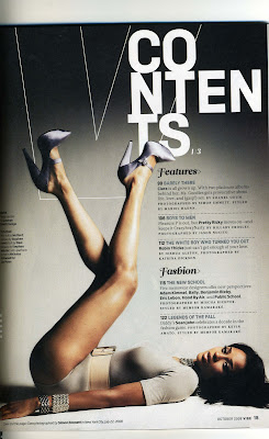
Vibe Contents Page Deconstuction
 This contents page is from 'Vibe' magazine. I like the way it is set out because it is different from other contents pages because there are not too many colours. I like the layout because it gives off a laid back vibe, which also links back to the title 'Vibe'. The 'V' from 'Vibe' is in the background because it from Vibe's logo, so the target audience would remember it more because there is more style added to it. 'Contents' is written in a really big font and it is not all written on one line so gives it an edge. The background is a gradient which highlights the model's legs, which would attract the target audience's eye; males. The gradient of the background also highlights the features in the magazine and the fashion section. Overall the design is quite simple and it uses mainly black and white and grey so it gives the contents page a classy look and appeals to the target audience. The main writing is all in one column so it is easy for the audience to read and the font that it is written in also has a laid back feel, so the target audience would feel like they can relate to it.
Sunday, 29 January 2012
'XXL' Magazine Cover Deconstruction
I bought an XXL magazine to get some inspiration of the style I need to use to make my magazine with by deconstructing it; there is an over-shoulder shot of 50 Cent on the cover, he is covering the 'L' on XXL, which is a common convention of R&B magazines. The main colours used are red, white and black. The artists name and the masthead are in red which gives more importance to them. The celebrity is wearing black and white clothes and most of the font is black, this everything in the magazine intact. The white background contrasts against all the bright colours, like red and dark colours. It uses basic and minimum colours so does not look too overcrowded. There are references to artists featured in the magazine which would tempt the audience to buy it and find out what is more about what the issues in the magazine are about. The target audience for this type of magazine are people who listen to R&B, young adults, men because they might look up to 50 Cent as a role model for example if they are an upcoming artist and teenagers aged about 16-18 because the articles and artists featured in the magazine are both current and R&B is a very current genre too.
Saturday, 28 January 2012
Music magazine task and my genre
For my next task I have to design a front cover, contents page and double page spread for a music magazine of any genre I like. It needs to look realistic and it needs to cater to my target audience. I am going to use Photoshop to complete this task. From the preliminary task I have learnt a lot of skills in Photoshop and I know what to work on and what I am good at.
At first I thought of basing the magazine on rock but I decided to make a R&B magazine instead because it is the type of music I am interested in. I like the style and the colour schemes used to make them. They are not too crowded and they do not use to many colours. I like the colour schemes that XXL and Vibe magazine use because they give the magazine a sophisticated look.

At first I thought of basing the magazine on rock but I decided to make a R&B magazine instead because it is the type of music I am interested in. I like the style and the colour schemes used to make them. They are not too crowded and they do not use to many colours. I like the colour schemes that XXL and Vibe magazine use because they give the magazine a sophisticated look.


Wednesday, 25 January 2012
Mastheads of various genres
 |
| This heading is effective because it is in a sans serif font, it has a backdrop and it is coloured in a bright colour. The masthead is outlined in a dark colour which contrasts with yellow and makes it stand out from the light background. Rolling stone describes a person who moves about a lot and never settles down; it is a rock magazine and it links to the fact that rock bands or singers are restless. The font used is different to other mastheads because it is a sans serif font and magazines usually go for a bolder look. |
 |
Billboard was originally known as 'Billboard Advertising' and it use to carry out news for outdoor amusements, coverage of motion pictures and of radio, it eventually moved into the music industry and was renamed simply as 'Billboard'. The meaning of the title relates to the magazine a lot, because it is advertising singers and information about them. The title is appealing because it has a lot of colours and it is bold, it links in with the magazine because it fits into the magazine's colour scheme which is mostly white, black and blue. The colours yellow and red are not part of the colour scheme but they still fit in with it because there is not too much of it. |
XXL is a mainstream hip hop magazine. The title XXL suggests that the company is a very large brand too. It stands out from everything else in the magazine because it is a cutout; it looks different. Even though the 'L' is covered by the artist 'The Game' consumers know which magazine it is because it is such a big brand. The masthead goes with the rest of the magazine because it uses red and white colours. The title stands out from the magazine while fitting in with it. This is so that it is the first thing that consumers notice.
 |
| This masthead is unique because it is a letter and people would be able to remember it easier than other magazine names because of this. Their logo is in red and white which are the colours that their magazines normally use. It links to the magazine's target audience; people who like rock music. It was originally going to be named 'Cue'; as in cuing a record. It was changed so that it would not be mistaken for a snooker magazine, and because the simple letter 'Q' stands out more on newsstands. |
 |
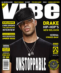
| Vibe is a Hip Hop and R&B magazine. The masthead instantly shows that it is a music magazine because it links to the meaning of 'vibes' from music. It has a bold title which holds the magazine together. Most of the font used is yellow so the white masthead stands out a lot along with the fact that it is the largest font used on the cover. The black background contrasts with the yellow and white font. The masthead appeals to the target audience of males and females aged 16-24 because the wording that it uses is current so that audience are able to relate to it. |
Thursday, 19 January 2012
NME cover, contents page and spread.
Subscribe to:
Comments (Atom)


