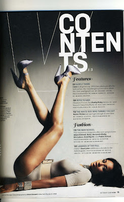
 This contents page is from 'Vibe' magazine. I like the way it is set out because it is different from other contents pages because there are not too many colours. I like the layout because it gives off a laid back vibe, which also links back to the title 'Vibe'. The 'V' from 'Vibe' is in the background because it from Vibe's logo, so the target audience would remember it more because there is more style added to it. 'Contents' is written in a really big font and it is not all written on one line so gives it an edge. The background is a gradient which highlights the model's legs, which would attract the target audience's eye; males. The gradient of the background also highlights the features in the magazine and the fashion section. Overall the design is quite simple and it uses mainly black and white and grey so it gives the contents page a classy look and appeals to the target audience. The main writing is all in one column so it is easy for the audience to read and the font that it is written in also has a laid back feel, so the target audience would feel like they can relate to it.
Monday, 30 January 2012
Vibe Contents Page Deconstuction
 This contents page is from 'Vibe' magazine. I like the way it is set out because it is different from other contents pages because there are not too many colours. I like the layout because it gives off a laid back vibe, which also links back to the title 'Vibe'. The 'V' from 'Vibe' is in the background because it from Vibe's logo, so the target audience would remember it more because there is more style added to it. 'Contents' is written in a really big font and it is not all written on one line so gives it an edge. The background is a gradient which highlights the model's legs, which would attract the target audience's eye; males. The gradient of the background also highlights the features in the magazine and the fashion section. Overall the design is quite simple and it uses mainly black and white and grey so it gives the contents page a classy look and appeals to the target audience. The main writing is all in one column so it is easy for the audience to read and the font that it is written in also has a laid back feel, so the target audience would feel like they can relate to it.
Subscribe to:
Post Comments (Atom)
No comments:
Post a Comment