 |
| This heading is effective because it is in a sans serif font, it has a backdrop and it is coloured in a bright colour. The masthead is outlined in a dark colour which contrasts with yellow and makes it stand out from the light background. Rolling stone describes a person who moves about a lot and never settles down; it is a rock magazine and it links to the fact that rock bands or singers are restless. The font used is different to other mastheads because it is a sans serif font and magazines usually go for a bolder look. |
 |
Billboard was originally known as 'Billboard Advertising' and it use to carry out news for outdoor amusements, coverage of motion pictures and of radio, it eventually moved into the music industry and was renamed simply as 'Billboard'. The meaning of the title relates to the magazine a lot, because it is advertising singers and information about them. The title is appealing because it has a lot of colours and it is bold, it links in with the magazine because it fits into the magazine's colour scheme which is mostly white, black and blue. The colours yellow and red are not part of the colour scheme but they still fit in with it because there is not too much of it. |
XXL is a mainstream hip hop magazine. The title XXL suggests that the company is a very large brand too. It stands out from everything else in the magazine because it is a cutout; it looks different. Even though the 'L' is covered by the artist 'The Game' consumers know which magazine it is because it is such a big brand. The masthead goes with the rest of the magazine because it uses red and white colours. The title stands out from the magazine while fitting in with it. This is so that it is the first thing that consumers notice.
 |
| This masthead is unique because it is a letter and people would be able to remember it easier than other magazine names because of this. Their logo is in red and white which are the colours that their magazines normally use. It links to the magazine's target audience; people who like rock music. It was originally going to be named 'Cue'; as in cuing a record. It was changed so that it would not be mistaken for a snooker magazine, and because the simple letter 'Q' stands out more on newsstands. |
 |
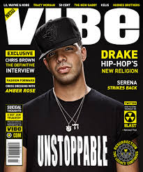
| Vibe is a Hip Hop and R&B magazine. The masthead instantly shows that it is a music magazine because it links to the meaning of 'vibes' from music. It has a bold title which holds the magazine together. Most of the font used is yellow so the white masthead stands out a lot along with the fact that it is the largest font used on the cover. The black background contrasts with the yellow and white font. The masthead appeals to the target audience of males and females aged 16-24 because the wording that it uses is current so that audience are able to relate to it. |
No comments:
Post a Comment