I have completed my preliminary media task. During this time, I learnt how to use an SLR camera and, although I had used Photoshop many times before, I learnt a lot when I was making my magazine cover and contents page. I made a lot of changes from my flat plan to my final piece.
When I was making the cover and contents page, people said that the colours I was using were too harsh, and needed to be more powdery and soft. Initially, my main colours were red, blue and white, I changed the red and blue colours to a softer red, and blue. Overall, it turned out much better than I had expected, and I completed much quicker than I expected myself to.
By having completed this task, it will positively affect other tasks that I will do in Photoshop, because I have better skills in using Photoshop and I know how to lay out my magazine and how to make it appeal to my target audience.
 Flat Plan
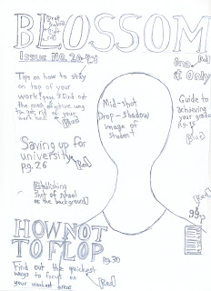
For my front cover, there is a mid shot of a college student, it is on the right side of the page, there is an establishing shot in the background. The title is red, in sans serif font. There are page references to tell people what the magazine talks about. For the contents page, the title 'contents' is in red and it is on three lines to make it look interesting. There is a transparent picture of a student studying, at the top of the page. The page titles take up most of the space. At the centre of the page, there is a picture of books in the background. The colour scheme of my magazine is red, blue and white.
When I was making the cover and contents page, people said that the colours I was using were too harsh, and needed to be more powdery and soft. Initially, my main colours were red, blue and white, I changed the red and blue colours to a softer red, and blue. Overall, it turned out much better than I had expected, and I completed much quicker than I expected myself to.
By having completed this task, it will positively affect other tasks that I will do in Photoshop, because I have better skills in using Photoshop and I know how to lay out my magazine and how to make it appeal to my target audience.
 Flat Plan
For my front cover, there is a mid shot of a college student, it is on the right side of the page, there is an establishing shot in the background. The title is red, in sans serif font. There are page references to tell people what the magazine talks about. For the contents page, the title 'contents' is in red and it is on three lines to make it look interesting. There is a transparent picture of a student studying, at the top of the page. The page titles take up most of the space. At the centre of the page, there is a picture of books in the background. The colour scheme of my magazine is red, blue and white.

No comments:
Post a Comment